A recipe for a more customer-centered virtual workshop experience
There’s a better way to run virtual Design Sprints.
The current virtual Design Sprint system doesn’t model the real world, and it’s a problem for both facilitators and participants. Virtual workshops already pose a threat to authentic human connection and optimum productivity due to their dispersed nature. Virtual Design Sprints add an additional element of stimulation fatigue because they are five days long–five full days of activities and information that we literally put in front of people’s faces. It’s a lot to take in, let alone process in a creative, constructive way.

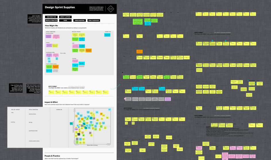
We’re not helping the remote dynamic by operating virtual Design Sprints from a one-canvas system. This system we’ve all subscribed to is favorable for the facilitator and not for the needs of participants. It conflates the deliverable with the work moments themselves–everything is jammed onto one digital canvas, from the instructions to the outcomes i.e. information overload. We don’t walk into an in-person meeting and write out instructions for the entire week on the whiteboard! This poor meeting problem facilitators are fueling in the virtual landscape conflicts with the goal of facilitation itself–to provide clients with a productive, innovative experience to reach solutions. The one-canvas approach doesn’t best serve participants; it in fact hinders the experience. We must do better. The world of virtual calibration needs a revamp.
Every virtual Design Sprint template in the world is massive, disorienting, and lacks focus.
Curating all sprint content onto one canvas–visible to all participants at all times–overwhelms and distracts attendees, and therefore takes away from meaningful work. This method does not mirror in-person sprints, which should be the goal.
Make Virtual Design Sprints Customer-Centered
In-person, facilitators intentionally set the stage to foster and support creativity in a Design Sprint. There is perhaps a blank whiteboard for which to transcribe workshop notes as they go. Tools are thoughtfully and timely distributed as the workshop unfolds; a facilitator doesn’t unload all of the supplies the group needs for the entire workshop on participants all at once. Instead, they replenish supplies and change what’s on the whiteboard accordingly. Why then would we overwhelm participants with a dump of visual information and supplies in a virtual setting? It’s stifling and counterproductive. Yet we’ve all been doing it. We’ve been so focused on delivery during virtual sprints, that we haven’t taken the time to look at different modes of operating.
I admit I fell into the trap too because that’s what I saw everyone else doing; it felt like the natural thing to do. But while running virtual Design Sprints in a one-canvas setup, I quickly realized there had to be a better method to collectively serve participants and make virtual facilitation more efficient.
We need to direct our focus back to the needs of the participants and return to doing one thing at a time–visually break things up to avoid cognitive overload. To do that, we must use a more proficient system that utilizes two canvases in the virtual space.
The 2-Canvas System
At Voltage Control, we want to help facilitators get back to a more customer-centered approach to facilitating workshops to optimize the participant experience. A 2-Canvas System is an operating system with a user-centered design. It allows facilitators to facilitate and synthesize in just two Murals versus multiple different Murals, and it saves participants from content overwhelm. Facilitators and participants waste a lot of time and suffer from split attention when they must find and open multiple tabs during a virtual sprint. Facilitators that use two canvases to lead virtual Design Sprints will increase the focus and amount of engagement with the audience by reducing the time spent opening up browser tabs. Designating one Mural template for the participant experience and one for facilitator organization and synthesis eliminates this problem.
Operating virtual Design Sprints with a 2-Canvas System increases facilitators’ ability to coordinate the workshop and streamlines things from the perspective of the participant.
Canvas #1
The main idea behind a 2-Canvas System is to mix up the deliverable/outcome of the virtual Design Sprint with the play-by-play of how to achieve it, instead of exposing participants to both. Rather than participants viewing both the deliverable (big picture objective) and process to get there (the moment-to-moment work) throughout the entire workshop experience on one canvas, the 2-Canvas System decouples them on two separate canvases.

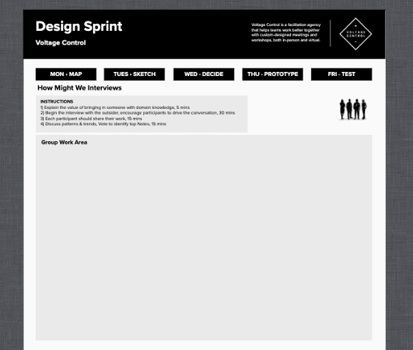
Participants only see one canvas throughout the virtual Design Sprint experience–the working canvas, or what we refer to as the ‘User Room’. It’s much like the physical space participants occupy in an in-person workshop–they only see what they need to see when they need to see it. They stay in one place (no more aimless wandering through handfuls of open tabs), and the facilitator swaps out the information accordingly. There is one instruction per slide instead of one giant Mural. Participants simply stay in the ‘User Room’. They need only focus on the canvas in front of them and the facilitator gives them everything they need.
Canvas #2
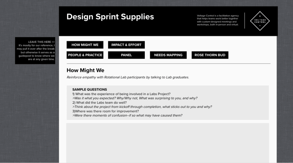
Facilitators actively design the participant experience in the ‘User Room’ canvas while simultaneously having access to a second canvas, which we refer to as the ‘Supply Room’. This second canvas is a facilitator only designated space for curation and synthesis of information, used to stitch together the deliverable later. There’s no need for participants to see this information while they’re working through the sprint; it distracts them from the work.

The ‘Supply Room’ offers a closer simulation of the facilitator experience IRL. It serves as facilitators’ personal notepad/whiteboard, a space for any and all collected data that’s only visible to them during the workshop activities. By the end of the sprint, the second Mural should tell the sprint story. The facilitator presents/communicates the curated information to the group, just like an in-person sprint, but it is not visible to participants until appropriate. This eliminates participants overwhelm and keeps them focused on the task at hand.
A 2-Canvas System allows a facilitator to design a much better participant experience for the moment on one canvas while still capturing the room intelligence on the other.

Think of it this way: Imagine being given an empty yearbook while in school and expected to fill it as you go throughout the year. It would not be as enjoyable of an experience as just being present in the moment; it would take away from living in the moment. In real life, you simply live and experience everything, then the yearbook is a commemorative collection of those experiences to reflect on later. That’s how in-person meetings are. You don’t walk into a meeting or workshop with everything figured out. Yet somehow, we went there with virtual and it became the norm; everyone copied it. And the system has caused problems. Participants get distracted and lost, they don’t know where they’re supposed to be on the digital whiteboard or what directions to read, when. It takes extra time to organize them, which takes away from time spent doing meaningful work. We lose control of the (virtual) room.
Facilitators Need Loose Control of the Room
A one-canvas system does not allow facilitators much control of a virtual Design Sprint, which is crucial for success. Facilitators must be able to control participants’ attention in the virtual space in order to allow attendees to do what they need to do. This may sound counterintuitive, but a level of loose control must be established so that participants have the freedom to think. If there are an insufficient structure and too much distraction (as is the case with a one-canvas system), participants will not be as focused and therefore not as creative and productive as they could be.
The solve: we need to be tight with intention and structure so that participants have the freedom to think. Right now it’s hard to give people this freedom because they’re lost; there’s too much going on. Facilitators can focus participant attention and gain control of the room with the help of specially designed 2-Canvas System tools.
A Better Virtual Design Sprint
The 2-Canvas System sounds great, but how do you implement it to make virtual Design Sprints efficient and effective? Our team at Voltage Control constructed an easy-to-follow roadmap for facilitators to lead better online Design Sprints. In partnership with MURAL, we created free intuitive virtual Design Sprint Templates. They’re just a download away.
The templates make integrating a 2-Canvas system easier for facilitators because we map out the mechanics on how to use them. It’s important to note that the intention of the templates is not to be prescriptive about the way they should be used. Instead, we’re being approximate; it’s about a more productive approach to virtual sprints and less about what facilitators are doing right or wrong. We don’t believe there’s an exact right way to do things, but we believe that by making these templates public, we’re increasing the craft of a discipline.
Benefits of 2-Canvas System
No matter how you slice it, remote facilitation requires so much more prep work than in-person workshops. The good news is that the 2-Canvas System does not require any more advanced work to prepare; in fact, our templates give facilitators many advantages that a one-canvas system cannot:
- Facilitators can more easily and quickly modify something on the fly during a virtual Design Sprint because of how the templates are coordinated. For example, if you want to change a participant’s name or make a modification to something that’s global, you don’t have to dip into other boards; you can do it all in one board.
- The consolidation of information is much easier because everything is in one place. Consolidation and acceleration are key to a facilitator delivering during a sprint.
- The templates do as much for facilitators in a small workshop as they do in a large workshop. They help facilitators stay organized and coordinated, as well as orchestrated with co-facilitators in bigger workshops. A 2-Canvas system allows acceleration in facilitator coordination; it’s easier for a supporting facilitator to provide support and assistance.
- Two working templates streamline the virtual Design Sprint Process for facilitators; there are no extra steps or wasted time. Facilitators get back to their process: 1) Understand the audience’s need 2) Create activities 3) Facilitate the activities 4) Synthesize.
Let’s stop the nonsense and insanity. Let’s create a much more enjoyable experience for the attendee and avoid cognitive overload so that we can do meaningful work now. Download our templates today to get started.
Need help building a better meeting? Bring in a professional facilitator from Voltage Control.
Voltage Control designs and facilitates innovation training, Design Sprints, and design thinking workshops, both in-person and virtual. Please reach out to us at [email protected] if you want to talk.


